Jump to Video
New Title II regulations will require all public websites (including public libraries) to be fully ADA accessible by April 2026 or 2027, depending on population service size. For more information on this rule, see Title II ADA Regulations for Websites and Mobile Apps.
A broad overview of the technical standard required by the ADA rule, Website Content Accessibility Guidelines (WCAG) 2.1, Level AA, and some general scanning tools is covered in Website Accessibility Essentials.
This tutorial covers an overview and some specific examples of website accessibility tools available to our WordPress+Divi websites, some of the current barriers we face in making our websites accessible, and some stop-gap measures steps you can take to make sure your website is prepared for all visitors.
Accessibility Essentials^
- Principles of accessibility in design
- Webpage accessibility evaluation tools
- AccessibleWP – WordPress Accessibility Plugin
Website structure
Website readability
Website navigation
Website features
* Indicates user control options available in the AccessibleWP toolbar
Principles of Accessibility in Design
Website accessibility in design assures the underlying structure of a website allows for functions needed by an individual using any kind of assistive technology to be able to access to perform actions on your website as easily as those using traditional technology tools.
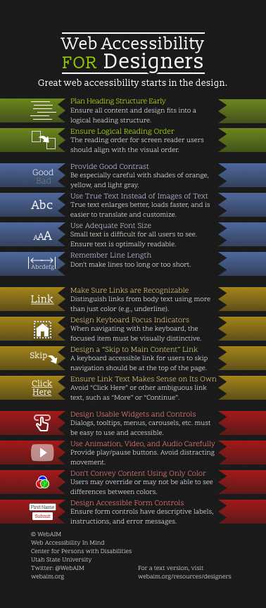
WebAIM offers a nice infographic to describe the role of designers in assuring website accessibility: https://webaim.org/resources/designers/
Webpage accessibility evaluation tools
There are several free tools that will scan a webpage and give a report on potential accessibility problems.
WAVE by WebAIM: https://wave.webaim.org/
accessScan by Accessible: https://accessibe.com/accessscan
axe-core Chrome extension: https://chromewebstore.google.com/detail/axe-devtools-web-accessib/lhdoppojpmngadmnindnejefpokejbdd?hl=en-US
PageSpeed Insights: https://pagespeed.web.dev/
There are tools that can address specific elements of accessibility.
WebAIM Contrast Checker: https://webaim.org/resources/contrastchecker/
– Evaluates the level contrast of two different hex code colors
ColorBlindly Chrome extension: https://chromewebstore.google.com/detail/colorblindly/floniaahmccleoclneebhhmnjgdfijgg?hl=en&pli=1
– simulate different kinds of color blindness on your site
Windows 10/11 Narrator screen reader
– Native application for Windows computers
NVDA screen reader: https://www.nvaccess.org/download/
– Open access screen reader application
JAWS screen reader: https://www.freedomscientific.com/products/software/jaws/
– Job Access With Speech screen reader
W3C.org Web Accessibility Evaluation Tools List: https://www.w3.org/WAI/test-evaluate/tools/list/
– List of additional tools for developers and web managers to evaluate websites and web content
AccessibleWP - Accessibility Toolbar plugin
The AccessibleWP accessibility toolbar plugin is a quick, reliable, and easy way to add functional accessibility features that the website user can control to your website.
This plugin adds an icon to the top right corner of the webpage.

When clicked, it opens a menu of options:
- Keyboard navigation
- Disable animations
- Contrast
- Increase text
- Decrease text
- Readable Font
- Mark Titles
- Highlight Links and Buttons

Divi struggles with some of these natively (read on below), but with this simple plugin a user with some visual and physical limitations can select settings that will make your library website more navigable to them.
Click here to learn more
Webpage Content Structure
Heading Structure
Plan Heading Structure Early
Ensure all content and design fits into a logical heading structure.
The heading structure is the outline of the content of a website. Headings are very important navigational markers for machine interpretation of visual appearance. Creating an outline structure for your page creates a logical structure for the website reader and listener to follow.
Example:
- H1: My Favorite Recipes
- H2: Quick and Easy
- H3: Spaghetti
- H3: Hamburgers
- H3: Tacos
- H4: Beef Tacos
- H4: Chicken Tacos
- H4: Fish Tacos
- H2: Some Assembly Required
- H3: Tuna Casserole
- H3: Lasagna
- H4: Vegetable Lasagna
- H4: Beef Lasagna
- H2: All-In
- H3: Crab-Stuffed Filet Mignon with Whiskey Peppercorn Sauce
- H3: Sun Dried Tomato and Pine Nut Stuffed Beef Tenderloin
- H2: Quick and Easy
Tips:
- Headings must use heading tags. Divi provides this tool under Design > Title Text in each module settings box.
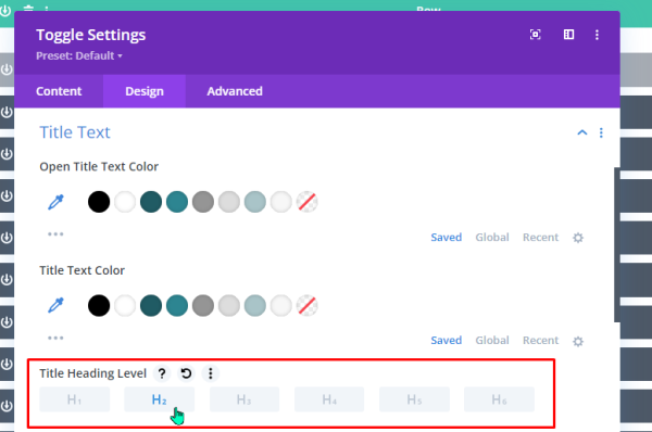
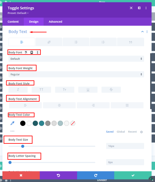
- Use headings only when they represent outline content. Heading text formatting should never be used as means of formatting text on a website simply for visual appeal. Divi offers options for selecting different text styles under Design -> Body Text.
- Use bullet points for unordered lists and numbers for sequenced lists. The computer will read these to a listener.
Installing the AccessibleWP plugin will give the user the option to highlight all headings on a webpage although it doesn’t differentiate between heading sizes.

Heading Structure in a Wireframe Website Planning Guide
Here is an example of a “wireframe” webpage planning guide with heading structure defined with header tags. See below for the text version. Note that the headers don’t always appear in top-down order on the visual page, but they make sense when read aloud in the given order.
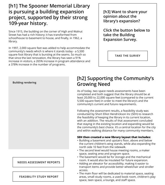
[h1] The Spooner Memorial Library is pursuing a building expansion project, supported by their strong 109-year history.
[paragraph] Since 1915, the building on the corner of High and Walnut Street has had a rich history; it has transformed from schoolhouse to basement to house, and finally, in 1962, a library.
[h2] Supporting the Community’s Growing Need
[paragraph] As of today, two space needs assessments have been completed and both suggest that the library should be at least 20,000 to 22,000 square feet (compared to the current 5,500 square feet) in order to meet the library’s and the community’s current and future requirements.
[h3] Want to share your opinion about the library’s expansion?
[paragraph] Click the button below to take the Building Expansion Survey.
Heading Structure Errors^
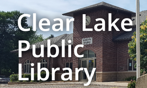
The most common heading structure error is when there is more than on H1 heading on a page.
In this example, the web design used formatting to arrange the name of the library, using the H1 header in two separate elements. A better practice would be to keep all of these together in a single element.

Website Readability
Contrast*
Contrast is the clarity and readability of text when paired with backgrounds of different colors. Text over an image is especially difficult.
Maximum contrast would be black text on a white background, or white text on black background. But visually a website would be boring if it were all black and white.
WebAIM warns particularly about using shades of orange, yellow, and light gray. The Contrast Checker (https://webaim.org/resources/contrastchecker/) scores two paired colors based on lightness/darkness and size of text. There is a AA and a AAA rating for levels of compliance. 4.5:1 is a “passing” score.
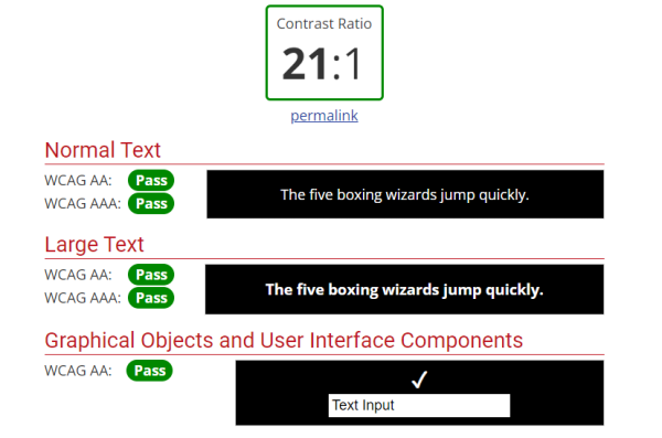
The image below shows contrast checker results for white text (hex value #FFFFFF) on black background (hex value #000000) with a contrast ratio of 21 to 1 and passing both WCAG AA and WCAG AAA tests.
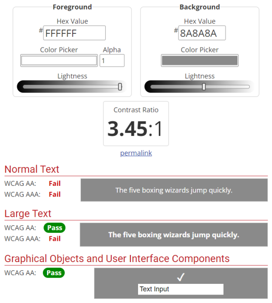
The image below shows contrast checker results for hex value #FFFFFF color white on hex value #8A8A8A hex value light grey background with a contrast a ratio of 3.45 to 1 and failing all WCAG tests.
Contrast errors - your website color palette
As new websites are built, we are testing the base website palette with the contrast checker from the very start. This has not always been the case, and contrast errors are a common failure on website accessibility scans.

Fortunately, this is one of the easier errors to address – but it does take time. Changing over website color schemes and branding is a project for the LEANWI website team.
Installing the AccessibleWP plugin will give the user the option to turn on a high contrast version of your website which also highlights links.

Use True Text (not images of text) and Alt+Text^
Machines cannot read text contained in an image (.jpg, .png, etc.), and often PDF documents are equally inscrutable. Perhaps with the improvement of AI, there may be a future in which an image of a poster with words on it can be read by a machine, but that is not today.
Click here to learn more

I have not tested the effectiveness of this.
PDFs should be made with an accessibility program (usually a paid version of Adobe, for example) to assure they are machine-readable.
In addition, images are not always scalable, and can be very difficult to read on small mobile screens.
Try reading this poster on your phone:

Best practice all around is to always use typed text.
HOWEVER, images are worth 1,000 words is still true, and are still key to a visual experience on a website.
Alternative Text is the tool we use for helping a machine and those using screen readers to understand the visual content of the website.
Use of alternative text is covered in detail in this training document and video: https://training.librarieswin.org/website-training/alttext/
Adequate Font Size*
The default font size for your website is set in the Theme Customizer:
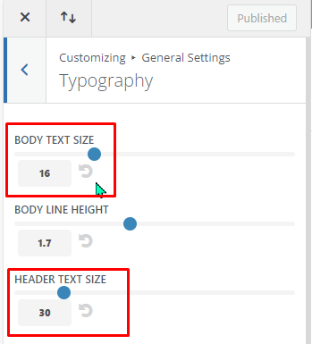
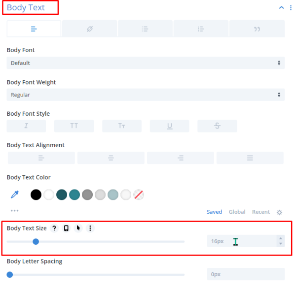
For most websites the size has been set two points larger than standard (16 pt instead of 14 pt). The Heading 1 text default size is 30 points.
The font size for individual Divi modules can be changed under the Design tab -> Body Text or Heading Text:
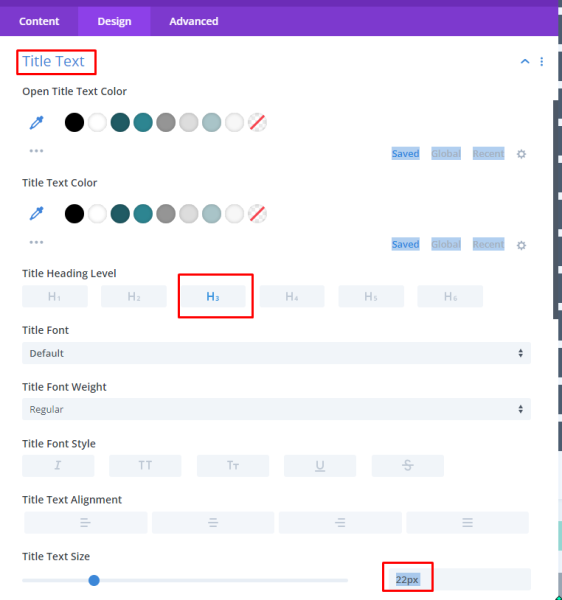
Remember the heading text size will change depending which level of heading you are using:
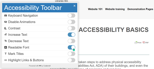
Installing the AccessibleWP plugin will give the user the three options for adjusting the font: increase text size, decrease text size, and select a readable font.
Website Navigation
Text Links*
WebAIM recommends making links distinguishable using more than just a color change (i.e., format with underline, bold).
Unfortunately, WordPress and Divi do not make this easy. It requires CSS customization which can behave inconsistently across sites. The LEANWI team can work on options for this over time.
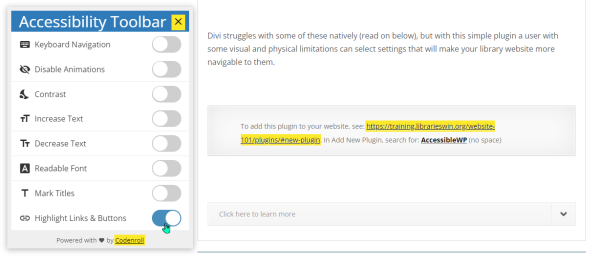
Installing the AccessibleWP plugin will give the user the option to highlight links and buttons to make them more visible.
Link errors^
One of the most common errors I see in accessibility scans are link errors, such as:
- Broken links
- “Suspicious” links
- Redundant links
Sometimes these errors can’t be easily fixed – for example, a link to a Google Form may result in a “suspicious link” error because the URL contains a mixture of nonsense letters and symbols, but you can’t change that.
Broken links are obviously an easy fix – something in the module isn’t registering correctly, so check the link listed in the module and update it.
Redundant links might be part of early website design that CAN be easily fixed. Example:

In the Online Resources module on the back end, we see there is a link listed in BOTH the Title and Module link area. We only need one of these – so the simple fix is to delete one of these, save the module, and the error will be gone.
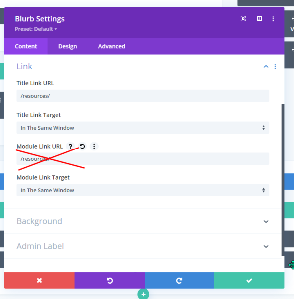
One other link error would be an ARIA error where a link is embedded in an element (image, text module, or blurb module are the most common). For this, we need to designate the “role” of that module as a “button” – or an element that links out to something else.
ARIA errors
ARIA (Accessible Rich Internet Application) is an way of communicating the role of a link or element on your website. This is something hidden in the HTML code but helps a machine interpret an element’s function which might be obvious from a visual perspective but needs code to describe on the backend.
ARIA errors are common in website accessibility scans. In some cases these errors may indicate a broken link, as was the case with this “Browse New Titles” anchor link on a webpage. This was easily fixed by updating the link.

In many cases library websites have modules (text, blurb, etc.), that link to something else. Their “role” is as fancy <button> with text or images, but is not indicated in the HTML – as seen in this error:
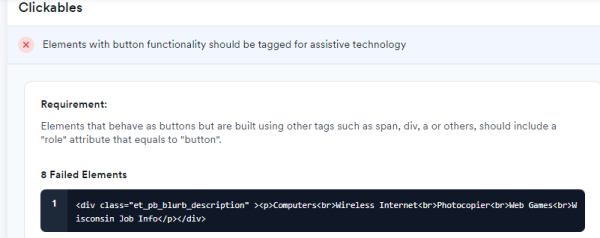
Indicating this blurb module does not have an HTML role assigned:

If your website has the Divi Supreme Pro plugin installed and activated, there is a method for adding a custom attribute to a module. Email websitehelp@librarieswin.org if you would like this plugin installed and training on how to add ARIA labels.
Once the Divi Supreme Pro is added to your site, you will have the option to add “Attributes” under the Advanced tab in the module settings:
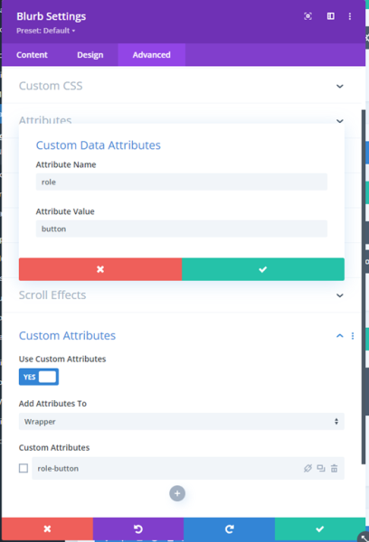
We can add something similar for other common missing attributes such as:
- Include an element in the tabbing order:
Add to: Wrapper, Title: tabindex-0, Name: tabindex, Value: 0
- Exclude an element in the tabbing order:
Add to: Wrapper, Title: tabindex-1, Name: tabindex, Value: -1
- Add an aria-label:
Add to: Wrapper, Title:aria-label, Name: aria-label, Value: Opens on a new page
- Add a rel attribute:
Add to: Wrapper, Title:rel-noopener, Name: rel, Value: noopener
Other Website Features
Widgets, plugins, and "stuff"^
Beyond the Divi elements, add other features to your website with some caution. Extras we know are accessible:
- Bibliocore, Aspen, Pika books carousels
- Tockify calendar website plugin
- My Calendar website plugin
Other sliders or elements added through plugins may not be. An example of a questionable feature is MetaSlider, which has limitations in both responsiveness and accessibility.
Website Animation*/^
Website animation, video, and audio should be used with caution. Most LEANWI websites only use the post slider for animation, but we have all encountered websites that try to jazz up their content or advertising with auto-playing videos or audio (“Where is that noise coming from???? Which tab??”) or try to make their content look fun with moving things.
Even regular users can find overly active websites distracting and annoying. So don’t do that.
Installing the AccessibleWP plugin gives the user the option to disable animations, including the post slider function.

Using Color to Convey Information^
Users may override or may not be able to see differences between colors on your website.
One example is a booking program that uses shades of green and red to indicate “available” and “reserved.” Red-green colorblindness affects about 8% of the population. Without text indications, these individuals would not be able to discern whether a room is available or not.
Also, if a user has enabled the “high contrast” setting on the AccessibleWP toolbar, they would not see these colors at all.
To test your site against various levels of colorblindness, try the ColorBlindly Chrome extension:
Accessible Form Controls^
Divi includes the Contact Form module, and several libraries use an email campaign plugin with a newsletter signup.
The Contact Form module is very bare bones. Using more descriptive language in the form fields helps a user with assistive technology understand what each form field is asking for:
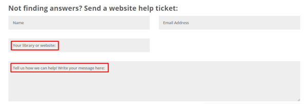
Note: in the below image of a newsletter signup form, the screen reader reads the * asterisk, but it does not read the correlating information that it is a required field:
![subscribe to altoona public library newsletter *indicates required email address * [form field] first name [form field] last name [form field] subscribe <a href='#' class='small-button smallblue'></a>](https://training.librarieswin.org/wp-content/uploads/2024/05/Accessibility-27.png)
How do I get to 100%?
We all are still learning about website accessibility. This Google doc is an evolving document capturing some of the basic and advanced things that can be done to increase accessibility scores on various platforms – both by the LEANWI website team and individual website managers. More is added as we learn more.


