Jump to Video and Slides
This tutorial will present:
A more detailed review of website accessibility tools specific to WordPress and Divi is covered in Website Accessibility – Essential WP and Divi Tools.
Website Content Accessibility Guidelines (WCAG) 2.1 - POUR
Briefly, WCAG (Web Content Accessibility Guidelines) 2.1 Level AA are a set of internationally recognized standards developed by the World Wide Web Consortium (W3C). These describe the technical standards of how website design and content should function in order to be accessible to all types of users using traditional and adaptive/assistive technologies.
These standards can be broken into four main areas with the acronym “POUR.”
P: Perceivable
O: Operable
U: Understandable
R: Robust
We will take each letter individually to understand what these items mean and how they are applied to websites.
For this discussion, we will review all criteria necessary to achieve Level AA. To achieve Level AA, all Level A and AA items must be addressed. There are additional criteria that would bring a website up to Level AAA. Those specifics can be reviewed on the WCAG 2.1 website.
P: Percievable
“Perceivable” means an item on a webpage can’t be left invisible to a user based on their available senses. A person with limited/no vision should be able to perceive the information audibly (with adaptive technologies like a screen reader), a person with limited hearing should be able to read captions for videos or audio content, content should be design for a person who cannot see differences in color or read fancy fonts.
Specific guidelines and success criteria for achieving perceptibility from WCAG 2.1, up to Level AA are as follows:
Guideline 1.1 – text alternatives are provided for non-text content
- Success criteria
- Use alternative text for images
- Use alternative text for images
Guideline 1.2 – alternatives for time-based media (video and audio) are provided
- Success criterium
- use captions for videos and audio recordings, pre-recorded or live (Level AA)
Guideline 1.3 – content can be presented in different ways without losing information or structure – or – content is robust enough to adapt to a variety of presentations
- Success criteria
- the structure of the website can be understood by machines and humans
- correct reading sequence is clear
- content doesn’t rely only on colors or shapes or visual location, etc., to be understood (Level AA)
- orientation is not a constraint (responsive design) (Level AA)
- the purpose of input fields in forms collecting information is clear (Level AA)
- purpose of website elements (icons, controls) is clear to machines and humans (Level AA)
Guideline 1.4 – content is easy to see and hear, distinguishing foreground from background
- Success criteria
- color is not the only means of conveying information, indicating an action, prompting a response, or distinguishing a visible element.
- automatic audio lasting more than three seconds has an obvious way to pause or stop or control the volume
- contrast for text and images of text has contrast ratio of 4:5:1 (Level AA)
- text can be resized without assistive technology up to 200% without loss of content or functionality (Level AA)
- text is used instead of images of text unless the image of text can be visually customized to the user’s requirements (Level AA)
- required scrolling is limited to specific pixels vertical and horizontal (Level AA)
- contrast for non-text items (e.g., radio buttons, star ratings) is 3:1 (Level AA)
- text and line spacing, letter and word spacing in text styles meets given criteria (Level AA)
- content that appears on hover or keyboard focus meets specific interaction criteria (Level AA)
O: Operable
“Operable” means any user can operate the functions of a website without interruption using a variety of physical and mental tools. Website functions should be as easy to use whether a person uses a mouse, a keyboard only, a touchscreen only, a screen in portrait or landscape mode, or is listening to the content being read or needs the text adjusted for clear viewing – or combinations of all of the above.
Specific guidelines and success criteria for achieving operability from WCAG 2.1, up to Level AA are as follows:
Guideline 2.1 – all functionality is available from a keyboard
- Success criteria
- all functionality of the content is operable through a keyboard interface
- a user can navigate to all sections of a page with standard keyboard strokes and not become “trapped” in a section of the page
- if keyboard shortcuts are enabled (using single letters, punctuation, symbols), they can be turned off or remapped, or are only active when in focus
Guideline 2.2 – users have enough time to read and use content
- Success criteria
- time-limited components allow a user enough time or the timing can be disabled/modified by the user
- moving, blinking, scrolling or auto-updating items can be paused, stopped, or hidden
Guideline 2.3 – content is not designed in a way that is known to cause seizures or physical reactions
- Success criterium
- web pages do not contain anything that flashes more than 3x per second
Guideline 2.4 – it is clear to users how to navigate, find content, or determine where they are on a page
- Success criteria
- blocks of repeated content (headers) on multiple webpages can be by-passed
- webpages have titles that describe the topic or purpose
- webpages are structured so they can be navigated sequentially in a logical reading order
- the purpose of each link can be determined from the link text or context, unless it is meant to be ambiguous to all (Level AA)
- there is more than one way to locate a webpage within a website (unless it is part of a specific step in a process) (Level AA)
- headings and labels are used to describe topics and purpose (Level AA)
- there is a clear focus indicator of for any keyboard operable interface (Level AA)
Guideline 2.5 – input modalities make it easier for users to use inputs besides keyboard
- Success criteria
- if navigation requires movement through a specific defined path that may be difficult to control with a mouse or on a touch screen, alternative methods are available (e.g., pinching to zoom, swipe to slide have alternative button controls)
- alterative motions are available for multiple pointer actions (e.g., drag-and-drop)
- symbols used to represent text should have clear textual labels: e.g., icons have a text label, keyboard symbols used as icons (example “>” for arrow) have labels; proper mathematical symbols should be used for formulas or spelled out in words
- elements that use motion activation can be disabled
U: Understandable
“Understandable” means content on a website should be easily grasped by all users. Website content should avoid jargon or complex language, should have clear explanations for how to use website functions, and the way the information is presented should change only in predictable ways (example, returning search results or submitting a form).
Specific guidelines and success criteria for achieving understandability from WCAG 2.1, up to Level AA are as follows:
Guideline 3.1 – text is readable and understandable
- Success criteria
- language of the page is clear
- language of parts of the page are clear (Level AA)
Guideline 3.2 – webpage appearance and operation is predictable
- Success criteria
- changing focus (keyboarding) to a user interface component does not change context of the item (e.g., highlighting an item doesn’t trigger a new menu that automatically moves the cursor off of the previous highlighted item)
- changing input (selecting a user interface element) causes a predictable outcome
- navigational mechanisms that are repeated on multiple Web pages within a set of Web pages occur in the same relative order each time they are repeated (Level AA)
- components that have the same functionality within webpages are identified and behave consistently (Level AA)
Guideline 3.3 – input assistance to help users avoid and correct mistakes
- Success criteria
- if an input error is detected, the item that is in error is identified and described to user in text
- labels or instructions are provided when content requires user input
- if input error is automatically detected, suggestions for correcting are provided when possible (Level AA)
- webpages for financial or legal transactions or modify/delete user-controlled data in storage systems or for test responses, submissions must be reversible, input is checked for errors, submission is reviewed and confirmed (Level AA)
R: Robust
“Robust” means content and function on a website should remain accessible over a wide variety of available technologies, both older and emerging. Backwards and forwards compatibility of website functions ensures that users accessing a website from a variety of tools will be able to interact successfully with your website. This guideline addresses the fact that websites have evolved rapidly, sometimes to the point of “breaking” or functioning poorly on older browsers or have not kept up in development enough to be usable with newer assistive technologies.
The specific guideline and success criteria for achieving robustness from WCAG 2.1, up to Level AA is as follows:
Guideline 4.1 – compatibility with current and future platforms and assistive technologies
- Success criteria
- HTML tags are complete, elements do not contain duplicate attributes
- names, roles, values are clearly defined for user interface components
- provide status messages indicating changes in content (e.g., “5 results returned” text after a search is initiated)
Webpage accessibility evaluation tools
Also note, as this new ADA rule becomes more well-known the number of paid services offering to audit and maintain your website is growing. There are still many free services, and we may update this resource as we learn of more options.
This section will cover:
- overall webpage/site scanning tools
- tools for specific elements
- adaptive technologies frequently used to access websites (i.e., screenreaders)
General webpage/site scanning tools
WAVE by WebAIM: https://wave.webaim.org/
accessScan by Accessible: https://accessibe.com/accessscan
PageSpeed Insights: https://pagespeed.web.dev/
Squidler.io: https://squidler.io/
– runs a simulation of a user accessing your entire website – must sign up to receive full report
Website extensions:
WAVE browser extensions: https://wave.webaim.org/extension/
axe-core Chrome extension: https://chromewebstore.google.com/detail/axe-devtools-web-accessib/lhdoppojpmngadmnindnejefpokejbdd?hl=en-US
Siteimprove Accessibility Checker (Chrome and Edge): https://chromewebstore.google.com/detail/siteimprove-accessibility/djcglbmbegflehmbfleechkjhmedcopn?hl=en&pli=1
Have a tool you love? Share it with us! Email websitehelp@librarieswin.org
Tools for assessing accessibility of specific website elements
WebAIM Contrast Checker: https://webaim.org/resources/contrastchecker/
– Evaluates the level contrast of two different hex code colors
ColorBlindly Chrome extension: https://chromewebstore.google.com/detail/colorblindly/floniaahmccleoclneebhhmnjgdfijgg?hl=en&pli=1
– simulate different kinds of color blindness on your site
W3C.org Web Accessibility Evaluation Tools List: https://www.w3.org/WAI/test-evaluate/tools/list/
– List of additional tools for developers and web managers to evaluate websites and web content
Have a tool you love? Share it with us! Email websitehelp@librarieswin.org
Adaptive/assistive technologies
Windows 10/11 Narrator screen reader
– Native application for Windows computers
NVDA screen reader: https://www.nvaccess.org/download/
– Open access screen reader application
JAWS screen reader: https://www.freedomscientific.com/products/software/jaws/
– Job Access With Speech screen reader
Have a tool you love? Share it with us! Email websitehelp@librarieswin.org
Tools for creating accessible content
This section will cover:
- Alternative text for images
- Creating accessible documents (text, spreadsheets, presentations, PDFs, etc.)
Creating accessible images
Free AI Image Alt Text Generator https://ahrefs.com/writing-tools/img-alt-text-generator
WordPress: adding alt text to images https://training.librarieswin.org/website-training/alttext/
Canva: adding alt text to images https://www.canva.com/help/using-alt-text/
Adobe Acrobat: adding alt text to images https://elearning.adobe.com/2024/02/how-to-add-alt-text-in-adobe-acrobat-a-step-by-step-guide/
University of South Carolina step-by-step instructions for writing alternative text: https://sc.edu/about/offices_and_divisions/digital-accessibility/toolbox/best_practices/alternative_text/step-by-step-instructions-alt-text/index.php
Accessible image creation
Canva Use Design Accessibility https://www.canva.com/help/using-design-accessibility/
Have a tool you love? Share it with us! Email websitehelp@librarieswin.org
Creating accessible documents
All documents:
Microsoft Support Improve accessibility with the Accessiblity Checker https://support.microsoft.com/en-us/office/improve-accessibility-with-the-accessibility-checker-a16f6de0-2f39-4a2b-8bd8-5ad801426c7f#PickTab=Windows
– Native, inbuilt Accessibility Checker for Outlook email message, Word document, Excel spreadsheet, PowerPoint presentation, or OneNote notebook
section508.gov – Create Accessible Documents https://www.section508.gov/create/
– US government guidelines on creating accessible documents, presentations, spreadsheets, PDFs, audio/video, and social media that comply with federal standards
Google Support Make your document, presentation, sheets & videos more accessible https://support.google.com/docs/answer/6199477?hl=en
Creating accessible word processing documents
section508.gov Create Accessible Word Documents https://www.section508.gov/create/documents/
Bureau of Internet Accessibility: Creating Accessible Documents in Google Docs https://www.boia.org/blog/creating-accessible-documents-in-google-docs
Creating accessible spreadsheets
section508.gov Create Accessible Excel spreadsheets https://www.section508.gov/create/spreadsheets/
University of Colorado Boulder Google Workspace Accessibility – Sheets https://oit.colorado.edu/services/messaging-collaboration/google-workspace/accessibility/sheets
Creating accessible presentations
section508.gov Create Accessible PowerPoint presentations https://www.section508.gov/create/presentations/
The Accessibility Guy: How To Make Google Slides Accessible https://theaccessibilityguy.com/how-to-make-google-slides-accessible/
Creating accessible PDFs:
PAVE PDF.org https://pave-pdf.org/
section508.gov Create Accessible PDFs with Adobe Acrobat DC https://www.section508.gov/create/pdfs/
Microsoft Support Create accessible PDFs https://support.microsoft.com/en-us/office/create-accessible-pdfs-064625e0-56ea-4e16-ad71-3aa33bb4b7ed
Creating accessible diagrams and infographics
Making a diagram screen reader friendly https://blog-nrrd.doi.gov/beyond-auto/
Accessibility.com How to Create Accessible Infographics And Data Visualizations https://www.accessibility.com/blog/how-to-create-accessible-infographics-and-data-visualizations
Have a tool you love? Share it with us! Email websitehelp@librarieswin.org
Creating accessible media
All audio, video, and synchronized media:
section508.gov Create Accessible Audio- and Video-Only Media https://www.section508.gov/create/audio-video/
accessiBe: Subscribe to These Tips to Make Your YouTube Videos More Accessible
https://accessibe.com/blog/knowledgebase/make-your-youtube-videos-accessible
Have a tool you love? Share it with us! Email websitehelp@librarieswin.org
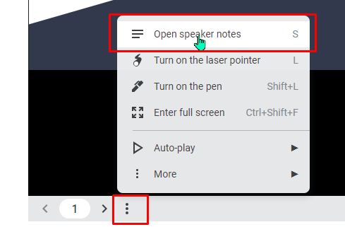
To view the speaker’s notes on the slides, click the three dots at the bottom and select “Open speaker notes.”