
Jump to Video and Slides
(updated 7/23/2025)
Understanding website structure, the skeleton of a webpage, is fundamental to building clean, navigable, and accessible webpages.
Even if you never plan to add a new page to your website without help from the LEANWI website team, the fundamentals of structure still apply to creating accessible website posts and applies to accessible documents, which may be important if you add PDFs to your website.
This tutorial focuses on understanding and managing website heading structure, specifically:
Heading Structure and Webpage Navigation
Outlining for Organization
Take yourself back to late elementary and middle school. If you had teachers like mine, they spent an impossible number of hours forcing us to re-write our textbooks in outline form, something like this:
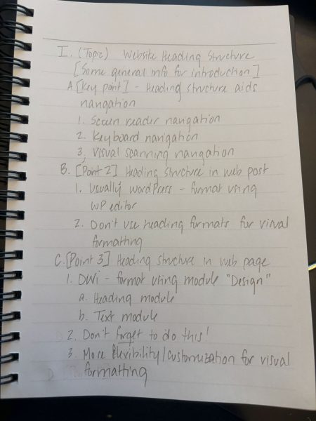
[Note: this dates me as being old enough to be handwriting my notes, but I also became the first person in my class to go home and type them up on a computer, which I continued to do in college.]
Outlining on the Internet
Turns out, this outline form is now the backbone of the entire internet – and especially the accessible internet. Each of those key points/letters/Roman numerals represent a navigation cue for a screen reader, a keyboard, or, ideally, for the eye of the person scanning your site looking for information on a specific topic.
Outline structure on the internet comes from HTML tags for “Headings.” Often the visible formatting for headings goes from large [bold] font sizes for Heading 1 (H1) down to the smallest [least bold] font size for Heading 6 (H6). Rarely is H6 used, especially on a library website.
Beware the internet crime: using Heading styles to format regular text in a post or text box.
Because computers and screen readers rely on the underlying format code to navigate, never, ever use one of these heading styles to simply change the look of text in your basic post.
Yes, it’s boring. But if you want a beautifully formatted post with different size fonts and styles, you either need to commit to learning HTML/CSS code, or to learning how to use Divi for posts and pages.
Heading Structure and Screen Readers
Screen readers use heading structure to read aloud the main landmarks of a page. This way a user doesn’t need to listen to the entire contents of a longer page when there is just one section they are looking for.
Keyboard navigation allows a user to move between headings only while skipping other text.
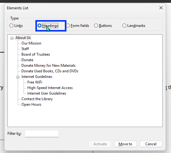
A screen reader can also show and read a navigation pane based on this information, like this:
The following video is a good way to see navigating headings using a screen reader in action:
Heading Structure in a (WordPress) Post, Overview
Making posts is often the bread-and-butter of a library’s interaction with their website. And often those posts have a very basic structure: title, text content, featured image.
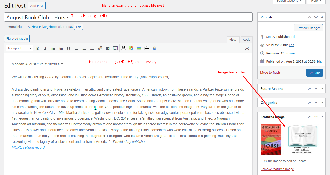
In both posts and pages, the title of the post/page is the page’s Heading 1 (H1). No headings are necessary in a short post.
The Short Post
99% of the time, a post in this format will be accessible as long as the featured image has alt text.
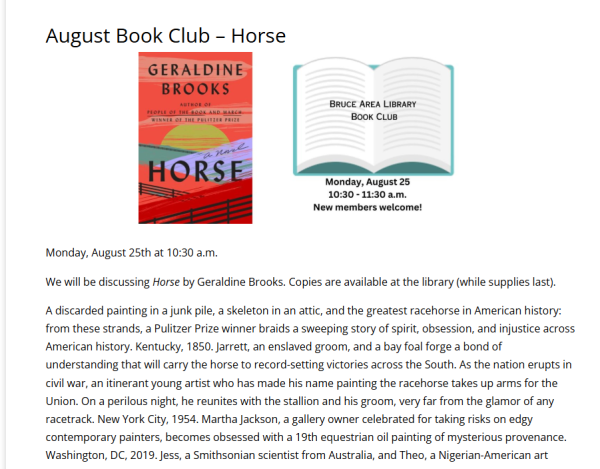
And this is how it looks to the website visitor:
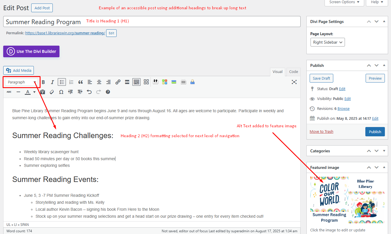
The Longer Post
In cases where a large amount of text and information is included in a post, it is best to break up that information into sections and divide it out with headings. This will improve readability for both traditional website visitors and those using screen readers.
This example uses several Heading 2 (H2) section titles to break up and organize text.
And this is how it looks to a website visitor. Notice how the H2 lines catch the eye for skimming for information:

Heading Structure in a (Divi) Page, Overview
Most LEANWI webpages are built using the Divi Builder. Divi Builder can also be used on posts.
While it takes more work to learn to use Divi, it does allow much more control over the visual appearance of headings (font, font size, formatting, etc.,) on individual pages.
Your website is set with a structure of defaults for heading styles (somewhat similar to the dropdown menu on posts, but in the main website settings).
Changing across your site is not a one-and-done change, and would require assistance from the LEANWI website team (websitehelp@librarieswin.org).
However, if you are working in a Divi module that contains text and a heading element, you can make changes on a page-by-page, post-by-post content. This way you can change the look of a header element on your page, but the underlying code tagging at as a <h1>, <h2>, <h3>, etc., won’t change and the screen reader will still be able to navigate it.
Common modules that have the header option include:
- Heading module
- Text and Toggle (note: in text and toggle modules, you can also use Heading dropdown in the WP text editor box as you would in a simple WP blog post)
- Blog and Post Slider
- Accordion (note: in text and toggle modules, you can also use Heading dropdown in the WP text editor box as you would in a simple WP blog post)
- Blurb
- Call to Action
- Tabs
Heading Structure in a (Divi) Page - Details
Each Divi module that has a text function has the ability to designate text as headings. There is also the ability to customize the appearance of headings within the module, which gives the page builder more control over the visual appearance of the page without affecting the structural function of heading structure.
It is crucial to be aware of and to use these features as appropriate.
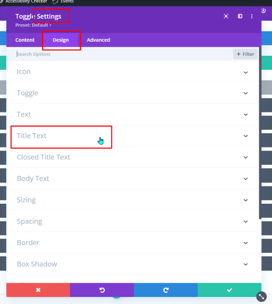
Designating and Customizing Headings in the Design Tab
Every Divi module that contains text will have a place to designate and customize Headings in the Design tab. This affects the heading status of the text entered in the Title or Heading field in the Content tab.
Depending on what the function of the module is, the location of the Headings menu vary slightly different in this tab, usually in the “Title Text” or “Heading Text” menu. While this can get confusing, it helps to have an understanding of the function of the particular modules.
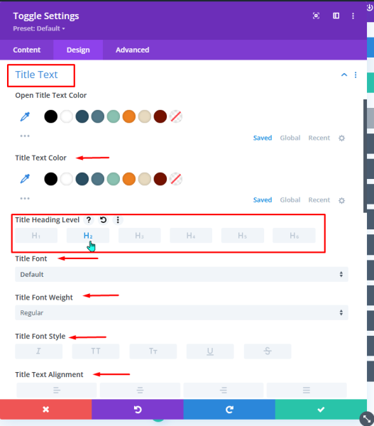
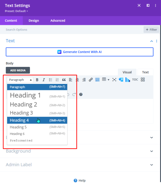
In the headings menu, you can designate the heading level of the Title Text or Heading Text of your module.
Remember, a webpage only has one H1 (Heading 1), and that is the title of the page or post. So 99% of the time, your page hierarchy will start with H2. (As shown in the example above).
Once you select your Title Heading level, you can allow WordPress/Divi to determine the defaults and go on with your editing. However, if you do want a different visual appearance to the heading of your module, this is the place to make those changes.
Note about site-wide defaults
Headings in Heading/Title Text vs. Content Text
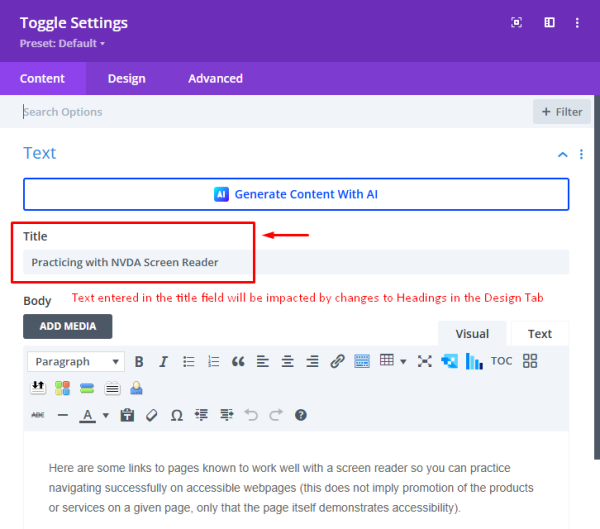
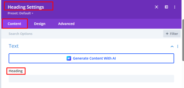
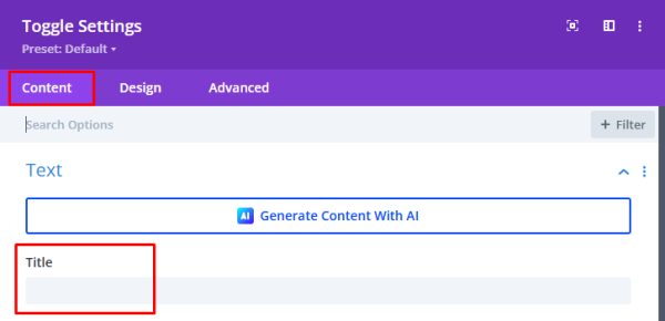
There are two places to be aware of Heading hierarchy in a Divi module: first is the Title Text or Heading Text, entered in the Title or Heading field in the main Content tab, the second is the text entered in the Body field.
Title and Headings Text
Below are screenshots of the Heading field and the Title text field in the content tab of two different Divi modules. These are directly impacted by changes made to Headings as described in the section above.
Body Text
Below is a screenshot of the content tab of a Divi Text module. This Body text editor functions exactly like the standard WordPress editor used for basic posts, as described in the sections above.
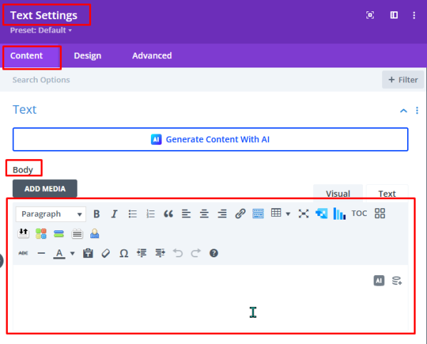
If long and complex text is entered in the Body field, it is necessary to use the Heading styles to create navigation guides in the module body text, the same way you would in a complex WordPress post.
Changes made to headings in the Design tab will NOT affect the appearance of headings in the Body content field.
Headings in a Document
Documents (Word, Google Docs), spreadsheets, presentations, and PDFs, are much more complex pieces of software than a webpage. Heading structure is less often correctly used in them, but equally important when they are accessed through a website.
Accessible documents are covered in more detail in other tutorials. Specific to document headings:
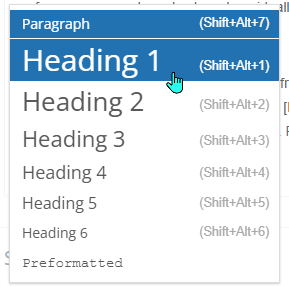
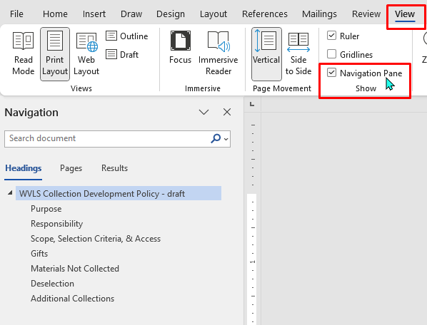
Word
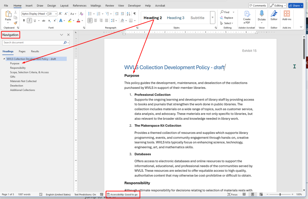
Heading structure in a Word document is managed in the “Styles” tab in the Home menu. When Heading styles are appropriately applied, it gives a clean, consistent look to the document and makes the document navigable, as viewable in the Navigation Pane (accessed from View > [Show] Navigation Pane).
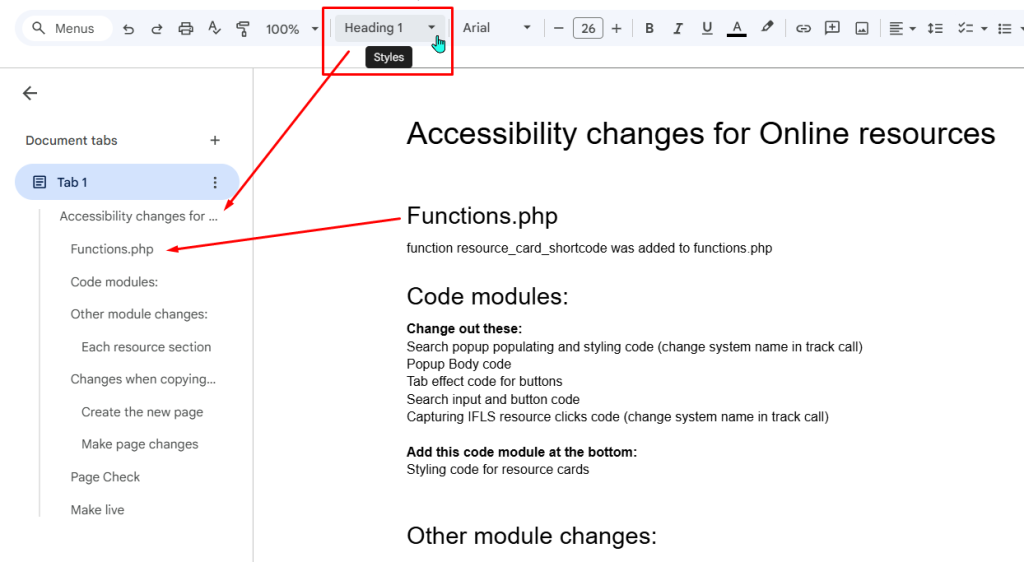
Google Docs
A reminder – if you use Google Docs to public documents, install the Grackle Docs add-on to check your document’s accessibility.
Google Docs functions similarly to Word, with the heading structure options in a dropdown menu in the main menu bar.