Jump to Video and Presentation
Setting a default color palette for your website will both improve the efficiency of any designing you do, plus, if the palette is well-chosen and used appropriately, assure that the colors you are using are good contrast and ensuring assessable design for your website.
This tutorial will cover:
Identifying colors on/for your site
The first step in setting a color palette is to choose and/or identify the colors and their HEX (hexadecimal triplet) code.
More about HEX codes
There are a multitude of tools for identifying colors displayed on a computer screen, many of them web browser extensions. These will identify any colors displayed in a web browser. Note: different monitors may display colors very differently. The color pickers should still identify the colors as the same color, but the rendered result may appear different on different screens.
Some tools:
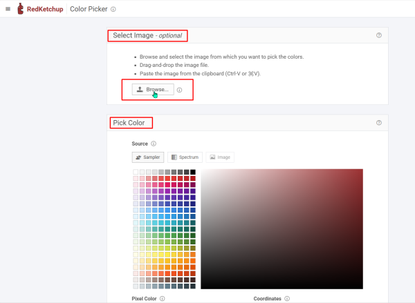
Pick colors from an image (upload JPG, PNG): https://redketchup.io/color-picker
RedKetchup analyzes colors from uploaded images, or lets you browse colors and gives the associated HEX. Reminder that colors render differently on different screens, so the same HEX may look different on a different device
Pick colors from a webpage using a browser extension (examples only, there are many out there, but check reviews and compatibility):
- Edge (How to add an extension to Edge): Hex Color Picker
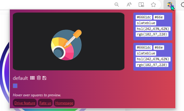
- Chrome (how to add an extension to Chrome): Eye Dropper
- Firefox: built-in Eyedropper tool
- Right-hand hamburger menu > More Tools > Eyedropper
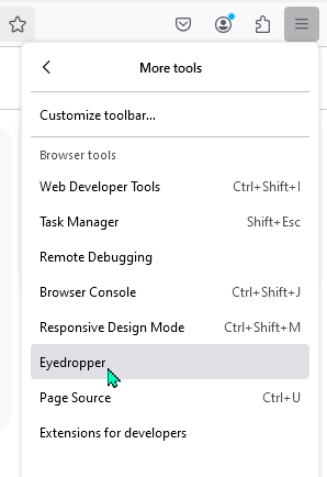
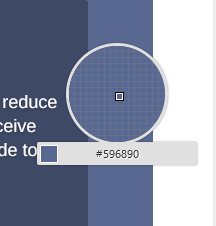
- Right-hand hamburger menu > More Tools > Eyedropper
Each of these tools will display the hex code for the selected color. Record these codes for use in the next step.
How to generate a color palette
Once you have identified colors, it’s time to create a color palette. If you are working off of a logo or existing site colors, you probably already have identified 2-3 base colors. The Divi color picker will allow you to add up to eight total colors. If you include black and white as default, and your 2-3 additional colors, you can create 3-4 additional colors for variety.
This is where some background in color theory and design can help. Some color palette tools include this information.
- Canva has a combination tutorial and tool for identifying and creating a color palette. If you regularly use Canva, you can use this to standardize branding colors (if you have the Pro version, you can even create a “brand kit” in Canva), and then you can export those HEX codes to your website.
- I have used the Super Color Palette tool fairly often as you can get up to 24 colors in your scheme (note, you really don’t need more than six). You can lock in a number of those hex codes and then generate additional colors and continue to lock in until you have a set you like.
- Coolors is similar to Super Color Palette but has some different settings. Unfortunately, many of the features are pro features. A couple of interesting tools: identify palette from uploaded photo (think logo), you can check black/white text contrast within the tool, and you can check for colorblindness (what would this palette look like to a variety of different types of colorblindness).
- If you are an Adobe user, they also have a color wheel. You don’t need to have an Adobe account to use it, but it would work more like the Canva tool works for Canva users – and is great if you are a more advanced color wheel user.
How to use a contrast checker
The next step is to test your selected colors for use with text with a contrast checker.
My preferred contrast checker is the WebAIM Contrast Checker. This tool identifies whether a text/background combo is compliant to a WCAG AA (minimum) or WCAG AAA (highest) standard using “normal” or “large” (14 pt bold or 18 pt normal) text.
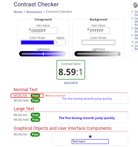
Input the colors you selected using a color picker in combination for text and background. You will need a contrast ration of 7:1 to pass all tests, and a 4.5:1 for AA at normal text size.
You can also use the tool to increase/decrease lightness and darkness of a particular color. You will need to make note of the new HEX value.
It may take some back-and-forth with your palette generator to find workable combinations. I recommend keeping text to a basic black or white on your website, but you can identify some other text color combos to work with your color palette.
How to set the color palette in Divi Theme Options
Once you have a set of 3-6 colors that have passed the contrast text with white/black/other color text, it’s time to set your Divi color palette.
This is probably the easiest step of them all.
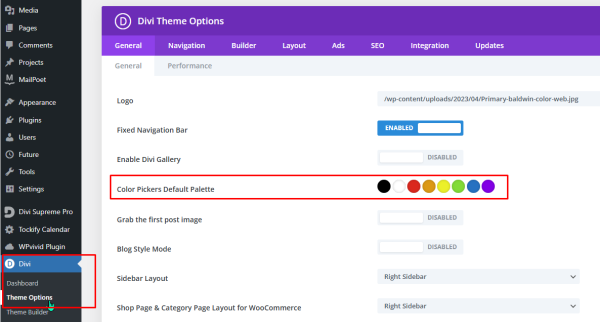
Simply click on the color swatch you want to replace, and type in the HEX code for your chosen color. Repeat for each of the color swatches you want to change.
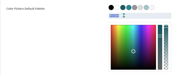
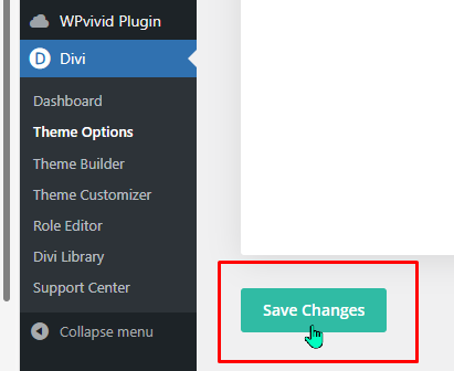
When all of your swatches are updated, remember to Save Changes at the bottom of the menu.
Next step is using the color palette in a Divi module.
How to use the color palette in a module
Now that you’ve done all the work of getting the color palette set up, it’s time to put your efforts to work in your Divi module designing.
In any Divi module that has a color setting (Toggle module shown below), there will be various places to set module colors. Once you have customized your palette in the Divi Theme Options, this palette will appear in these places. Most frequently you will see this in “Background” under the Content tab. In the example below, the “Design” tab is selected and options for the Open Toggle, Closed Toggle are shown. The same palette will display for any choices for color of text, borders, etc., etc.
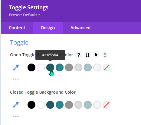
This will make your design life MUCH easier – AS LONG AS YOU REMEMBER to select color combinations that passed your Contrast Checker test. This is why we recommend having black and white as default theme colors and making sure your main colors are compatible with basic black and white.
But now you can have fun and know that you will have consistent colors in your design and be many steps closer to having an accessible website with high contrast color design.


