
Jump to Video
Canva is a popular graphics design tool that is both more approachable and cost-effective than some of the more complex graphic design tools like Adobe Publisher. However, accessibility features have traditionally been lacking.
Yet, with some careful forethought and understanding of how to design infographics and how Canva works as a program, you can make Canva present a basic screen reader-friendly infographic.
Note: this is only a first step to designing a fully-accessible infographic, which may also include additional elements such as hidden transcripts, aria labels, and alternative links. Note that Canva is not capable of many of these features, so this is not intended to be a tutorial for fully accessible content, but as a first achievable step for small libraries.
This tutorial discusses designing and publishing an effective infographic in Canva, specifically:
-
- Basic principles of infographic design for all audiences.
- Essential accessibility design features of infographics.
- Canva-specific elements and tools to create a screen reader-friendly version. Key takeaways:
- Use layers and “text semantics” to organize the content on your Canva design.
- Publish your design as a “Canva Website” and post link on website.
- Accessible infographic resources.
Basic principles of infographic design for all audiences.
Content
Why? All infographic design should begin with the why? Why are you creating this document. Carefully consider:
- Audience – who are you producing this for?
- End goal – why do you want them to care about this information?
So What? Numbers by themselves mean nothing. Provide context. Frame your information to tell a story. Write out whole phrases to explain what the numbers mean.
Simple language. Keep information and words to a 4-5th grade reading level unless you have a very specific audience need.
Choose your charts carefully. Understand what visual is going to best communicate your information.
- Types of charts:
- Bar chart: comparison of values
- Line chart: trend/Change over time
- Pie chart: parts of a whole
- Notes about charts and graphs:
- Don’t get fancy. 3-D and other tricks often distort visuals and are over stimulating.
- Don’t put too much information into a single graph.
- Use good contrast and design.
Organization
Once you have your information, organize it in a logical order.
- Begin with a clear structure and logical flow of information.
- Design your information to read from the top left to the bottom right of the page.
- Designate clear headings and use full text.
- Carefully consider visual elements: are they “decorative” or are they transmitting information? If visualizations (charts and graphs) are transmitting information, leave space on your design for descriptive text.
Essential accessibility design features of infographics
- Design using a heading structure. Lay out information in a clear reading order using defined headings.
- Use good contrast. Select colors using an inbuilt tool or the WebAIM Color Contrast Checker. Avoid red-green color combinations and do not convey information using only color.
- Use text to describe visualizations like charts and graphs. Don’t rely on alt text descriptions. Provide brief text overviews for charts and graphs within the document itself.
- Write in full but short sentences and use proper punctuation. Using punctuation can helps a screen reader to pause naturally.
- Use large, dyslexia-friendly fonts. Do not use fancy fonts. Use 12 – 14 point font sizes and no more than two different font styles.
- Use true text and not text of images. Write out text, don’t use words of text.
- Carefully consider visual elements. Select images that enhance the message. If you are using charts, be sure to have a full verbal description prepared for alternative text.
- Use alternative text. Unless an image is purely decorative, add alternative text that fully describes the image. For charts and graphs, state the type of chart and what the purpose of the chart is. (Example: alt=”Stacked bar chart comparing the four sources of library revenue across a four-year span, 2022 through 2025.”)
- Consider alternative means of communicating the information. You do not need to rely on a single form to communicate the same information to multiple audiences.
Canva-specific elements and tools to create a screen reader-friendly version
Once you have developed a layout with all of the essential infographic design and accessibility features in mind, here are some Canva-specific tips for creating as screen reader-friendly version of your infographic.
Add alt-text to describe images, charts, and graphs
Your original design should already include descriptive text for your images and charts and graphs, but additional alt text should be use to describe the type of image or chart or graph used and what its specific purpose is. Think of it as a caption for your visualization.
Example: alt=”Stacked bar chart comparing the four sources of library revenue, local county, city, other counties, and other, across a four-year span, 2022 through 2025.”
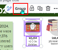
Use “Group” and “Layers” to determine reading order.
First, use the “Group” function to connect objects that a screen reader should consider a single unit. Often you will do this during the initial design process to control layout of objects, but this also is helpful in creating the reading order and hierarchical structure for the document.
Next, we will organize the reading order of items using the document “Layers.”
Canva does use headings (see “text semantics”) to create a hierarchical reading order, but grouping elements and positioning them using the “Position” > “Layers” feature enhances Canva’s ability to determine reading order.
The major consideration? The layers must be arranged “backwards” for the screen reader to read it forwards. Canva is first a graphic design tool. The bottom layer, the “last” item in the document, is listed first in the layer list.
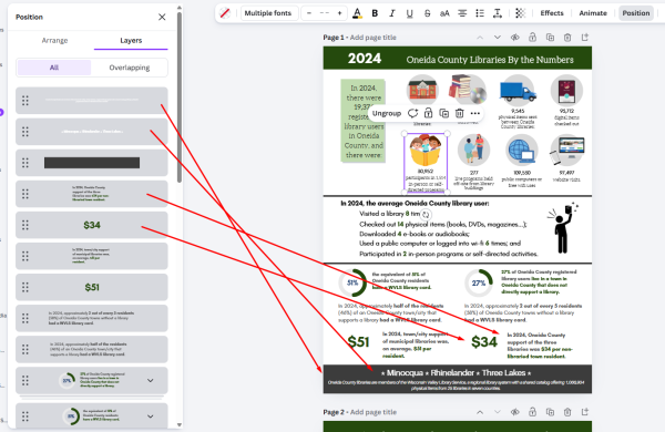
So in order to have the screen reader read the content in a logical order, you must organize the layers in a bottom-top order.
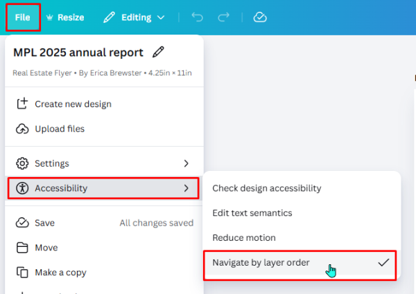
Then go to the Accessibility menu and confirm that the “Navigate by layer order” option is checked.
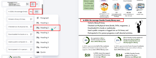
Use “Text Semantics” accessibility feature to add heading structure
Canva does now have rudimentary ability to create structure for your document using heading styles. Whether or not you need to use it for your infographic will depend on the overall complexity of your document. If you have a very simple layout, headings may not be necessary for navigation. But if it would be useful for people to use headings to “scan” for useful information, this is where text semantics comes in.
“Text Semantics” is found under the accessibility menu. This opens a sidebar editor that looks very similar to the Layers editor, except now the individual objects are listed top-bottom order. Grouped items are grouped together. Clicking on the carrot (^) icon will display the individual objects included in the grouping. Clicking on the three dots next to the item grouping will open a menu where you can select which heading level or style should be applied to the group – or individual items in the group.
There are six heading level styles plus paragraph and quote styles.
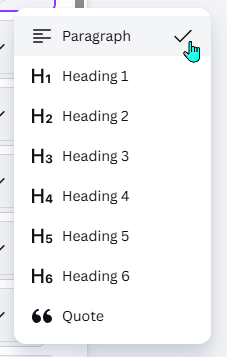
The default assignment is “Paragraph” text. To apply a heading style, simply select the option in the menu.
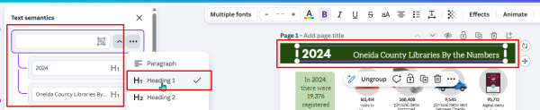
Remember that “Heading 1” is equivalent to the Title of the document, and there should only be one Heading 1 in a document. All the following headings should be Heading 2, 3, 4, etc.
By default the selected style will be applied to the entire group of objects. If you need to apply a heading style to an individual item within a group, click the carrot icon to open the drop down of objects contained in the group, then click the three dots next to the grouped object that needs a different style applied.
Continue through the document until the structure styles are applied.
Publish as a “Website” in Canva
Once you have the infographic organized, you will want to publish the item as a Canva website, not as a Public View Link etc. This preserves the reading order and the alternative text.
Note: if you do not immediately see the “Website” option in the Share menu, click on the three dots for See All and additional options will appear.
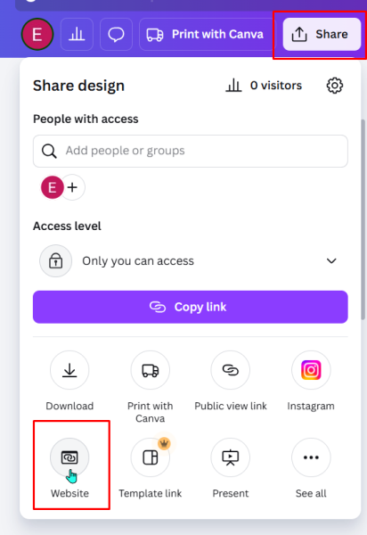
Note: once you have published the link, you can continue to make changes to your Canva document and when you republish, this changes will appear live on your link.
Now test your new infographic with a screen reader to make sure the content is being read in the proper order!
You can now add this link to your library website and share a screen reader-friendly version of your library infographic.
Publishing a Printable PDF version
Often a library wants to offer their newsletters, infographics, etc., as something that can be downloaded and printed. The other advantage to Canva is you can publish your design in multiple formats. To do this, post the accessible version as the primary document, and then post a secondary link with the label “Print [or Download] as PDF.”
Accessible infographic resources
Essential visualization design
Storytelling with Data: A Data Visualization Guide for Business Professionals by Cole Nussbaumer Knaflic – an excellent step-by-step book for understanding principles of good design with visuals while understanding how to translate those visualizations into storytelling.
Choosing the right chart
Choosing a Chart Type – UC Berkeley Library
Accessibility for graphics and infographics
General guidelines
Data Visualizations, Charts, and Graphs guide – Harvard University
Writing alt text for charts and graphs
How do I write alt-text for graphs? – Level Access
Technique: Describing graphs – Harvard University